Saturday, August 18, 2012

How to create a nude in pastel

I really enjoy using pastel as a medium. It  is particularly well suited to achieving soft tonal gradations and the delicacy of skin tones.

This drawing is one of Lyn, a lady who models for lots of art classes and groups around the Cambridge area.
It was done on tinted Murano mount board using a range of different pastels. I use both Winsor and Newton and Senellier soft pastels , as well as charcoal ( willow sticks and charcoal pencils) and conte.


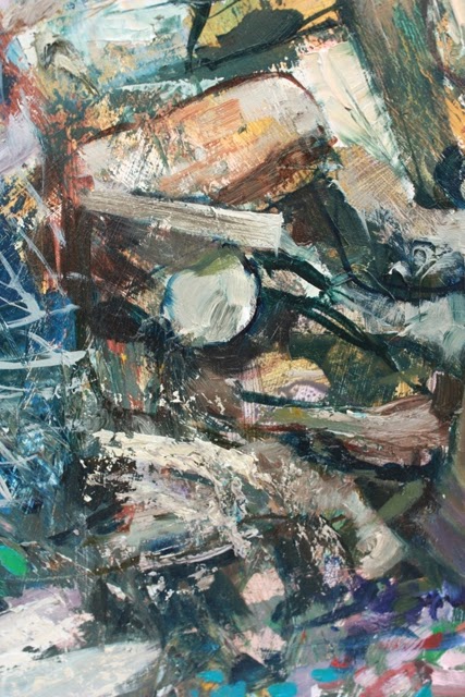
My initial tentative steps at placing the figure on the board are shown above. As can be seen, I didn't get it right first time, and changed the format to landscape. Frustrating, but there is no point in struggling on if the initial planning is wrong. This is done in charcoal. Here I am looking at rhythms through the figure, at basic proportions and angles. It is a very linear method and is only one way of approaching it. I will be considering alternative methods in future blogs.


As I am fairly happy with the basics, I now start blocking in the main masses paying a little attention to tone and colour. I say "little" because these are only the first tentative steps and I know that these will eventually be overlaid and modified. The darker areas are burnt sienna, the lighter tones naples yellow and yellow ochre. 


I now have to consider the background and begin blocking it in. I also make a start on the head. I am able to use soft pastels because very little fine detail is required on these larger areas. Sections like the head, hands and feet, I am careful not to overload and will dust them down before continuing on them. I use a combination of fingers, torchons and clothes to blend. How much blending one does is obviously a matter of personal preference or can be dictated by the subject matter. A wizened old man would suggest a bolder approach as opposed to the soft flesh of a baby.


The process continues. I pay more attention to light , shadows and reflected lights. I try to suggest the roundness of the forms and am also looking more closely at subtle colour variations within the flesh. I find myself adding cool blues and greens , overlaying them with softer pinks , sometimes blending them together , at other times leaving the colour underneath breaking through. This is a little like scumbling technique as used in oils. I am frequently asked what should my palette be? Everyone likes a formula it would seem. With pastels, I am a little at a loss for an answer. I have hundreds of pastels. The actual process is for me, to a large extent,  almost intuitive. I look closely and what I observe suggests a colour. Sometimes it seems a bizarre choice , but when blended works. Often, when I am doing a pastel demo to an art group, I start off using somewhat weird colours. It has a wonderful shock effect on the audience and certainly captures their attention. They clearly think I am mad! But the trick is to be able to pull the rabbit out of the hat and show
that by adding and overlaying, even this initial "disaster" can be turned into something pleasing.


When it comes to the head, I use a combination of conte crayons and pastel pencils then overlay in places with softer pastel.


The same approach is used when it comes to hands and feet.


Other areas are left softer and more diffused.


The finished drawing.


It was an attempt at a classical pose, both gentle and graceful. There was no desire to shock and reveal all. In many respects it is harder to capture the subtlety than present the viewer with a work where absolutely nothing is left to the imagination.

Perhaps that will be the subject of a future blog.

Friday, August 17, 2012

Painting with a palette knife.

Painting with a palette knife can be great fun. With it,  you can achieve a variety of bold textures you simply cannot get with a brush. Colours are mixed on the canvas and the resulting, often unexpected combinations, can surprise, and excite and be used to great advantage.
Paint is used straight from the tube and to increase volume one can also add things like Winsor & newton's Oleopasto or Rowney's texture paste.


To demonstrate some of the effects that can be achieved, I show a painting I did earlier this year.  "Colin's shed" . It is a large work measuring 48" x 36" done on MDF board.


In the above, you can see the rich textures and ridges  created with a large trowel -like palette knife. Titanium white, Cobalt blue, pthalo blue and  Old Holland violet grey were all mixed and scraped around on the panel.

Another section of the painting began in an even bolder way. Scratching  into the paint, scraping bits off, sanding it down.


And again


 Doesn't look like much at the moment.

Let me show you a larger section of the painting.

Or this


At this stage I had to decide whether to simply use a palette knife or to combine it with brushwork and a more traditional approach.  I decided to do the latter, but still retain many sections which were looser and more spontaneous.


And so to the finished painting.

The first image above is of a section of  the roughly textured , plastered wall. The second is of the pile of logs by the stove.

The third, is the underpainting for the pile of assorted bric a brac on the workbench.

Sections of the painting in closer detail.

Or

As you can see, "Colin's Shed" is an almost magical place. Within it is an array of memorabilia, clutter and in some places downright junk. But it is a warm and inviting retreat, a place where one can feast one's eyes and take journeys into the imagination.


Tuesday, August 14, 2012

How to paint a young child and cuddly toys

This was a recent commission. The challenge was to paint in oils this little lad surrounded by his favourite toys. At just over a year old, he wasn't for sitting still, so I had to resort to large number of photographs to work from. There then followed lots of discussion with his parents to see which, if any, captured him best.
In the end it was a combination of numerous ones which seemed to work best.

The painting was done on MDF board to which I had applied a couple of coats of acrylic gesso. To speed the process, I did the underpainting in acrylics.


I start by simply drawing with a brush and burnt sienna.


I start to lay in blocks of colour.


I tentatively position the features. The cool green of the underpainting is a nice foil to the warmer flesh tones on top. These are white plus yellow ochre, cad red.


Still working in acrylics, I now pay more attention to achieving a likeness, checking proportions and angles.


The temptation is to continue fiddling with the head, but I must move other parts of the painting along.


e.g. clothes, toys, toolbox and garden background.


I am now working in oils, to get the subtlety and softness required.

I am now at the fine tuning stage. Watch this space to see the finished painting and have my techniques explained in greater detail.